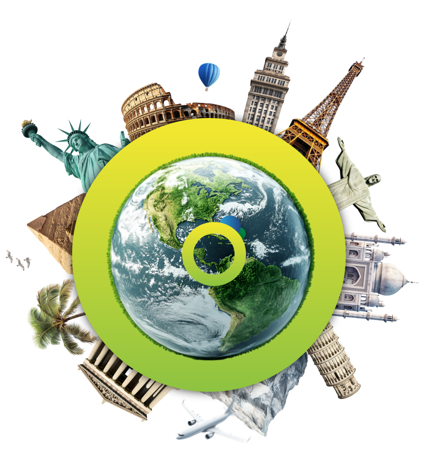
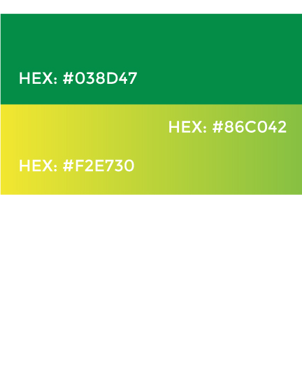
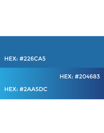
For International Medical Insurance, travel is an experience that deserves security and confidence. Their visual identity had to reflect this, so we transformed their image into a modern and powerful representation. The new identity not only refreshes the brand but also conveys the excitement of exploring the world with peace of mind.

The redesign of the International Medical Insurance logo reflects a clear and significant evolution. We moved from a design with rigid shapes and dull colors that felt outdated to a much more modern and dynamic visual identity.
Now, the complete circle symbolizes the world, a space full of opportunities to explore. The lines evoke the many paths that can be taken, and the two spheres represent the close relationship between the traveler and the protection that accompanies them every step of the way. This new design not only modernizes the brand but also communicates its purpose more clearly and emotionally: to provide security and confidence to every traveler on their adventure around the world.
Watch video


For a brand to connect with its audience, its identity must be clear, memorable, and adaptable. That's why the corporate image of International Medical Insurance was designed. Each element reinforces its values and purpose, ensuring effective communication and a brand that travelers remember.
The new identity of International Medical Insurance adapts to any digital medium, ensuring recognition and trust in every interaction. Its attractive and versatile design reinforces the brand's security and distinction worldwide.
Tell us a little about your project and we'll contact you very soon so that together we can make it a reality.
