Each of the business lines encompassed by Grupo Vivarc—Casa, Cosechas, and Deco—needed more than a logo;
they required a unified visual identity based on the essence of the umbrella brand, but with its own distinct personality. The challenge was clear:
How to convey nature, sustainability, and modernity in a single graphic concept?
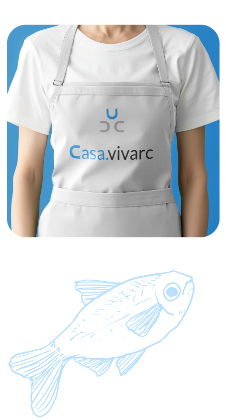
From the beginning, we opted for a visual identity based on simplicity and clarity, essential values of Grupo Vivarc. Typography became the cornerstone of the design, creatively integrating the initials 'C' and 'D' into a distinctive icon for each brand:


A sans-serif style that reinforces the feeling of modernity, professionalism, and elegance. Its visual clarity makes the brand easily recognizable and versatile for different formats.
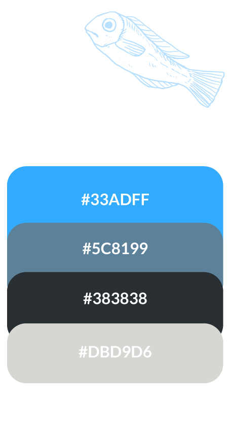
Easy to remember and tailored to its audience. Thanks to a strategic color palette and typography that conveys confidence and modernity, we created a solid visual identity that not only differentiated each product line but also consolidated Grupo Vivarc's overall image in the market.
Tell us a little about your project and we'll contact you very soon so that together we can make it a reality.
