It focuses primarily on monitoring, guiding, and integrating all students who need help in their academic or professional lives. As a result, “Parallel” was born, and with it came great ideas for designing its brand identity to attract many more people and make them feel comfortable and connected.
It's important to take good ideas and develop good concepts to achieve the best results. This all starts with creating a great logo to stand out from other brands. This proposal was composed dynamically with the best compositions using the letter "L." Within these compositions, a graphic was designed that represents the process and progress that people experience in each of the pillars or services that the brand offers.
This modern design ensured easy readability and brand recall. Adaptability was also considered, allowing for use at any time. The logo is easily integrated into various interfaces, such as print, scalable formats (any size), and different digital channels, including its website and LinkedIn profile. On LinkedIn, the logo was reimagined with updated iconography to represent it in a way that is legible and easy for customers to perceive, thus fostering brand recall.
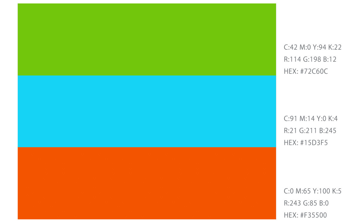
For Parallel, we worked on and designed the right colors for the brand to convey its message. Based on this, we implemented three main pillars, which are as follows:
Autonomy Gap: Selecting the green tone, which is linked to personal growth and the idea of youth.
Experience Gap: Selecting the blue tone, which symbolizes concentration and tranquility.
Skill Calibration Gap: Selecting the orange tone, which conveys fun, boldness, and progress.

As we all know, a logo must be accompanied by typography, and in this case, it's very important because it adds dynamism and depth to all the themes the brand wants to convey. For Parallel, the typeface used is bold and features curved terminals, which represent a closer connection with the users.
These were the digital proposals:
Tell us a little about your project, and we'll be in touch soon so we can make it a reality together.
