Learn how we shaped the logo and corporate image for Travesuras, a children's clothing brand with a nationwide presence. With intertwining curved lines and dots that sparkle with fun, we created a logo that captures the essence of childhood. Get ready to discover a world of Travesuras, where graphic design becomes the language of imagination and boundless fun.
For the design of the Travesuras logo, we delved into the world of children, who are the target audience of this clothing company. We wanted to convey feelings of fun, joy, and mischief through every stroke. Therefore, we selected a unique typeface that captured the essence of childhood. This became the visual language that communicates the essence of Travesuras: a world where fun and joy are dressed in style.
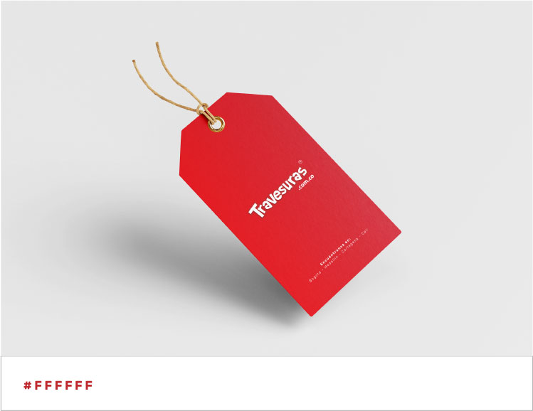
The Travesuras logo was designed with a perfect color combination. We used white as the base color to evoke innocence and freshness, while red was added to awaken energy and strength. This ideal combination captures children's attention and reflects the essence of the children's clothing brand, creating a balance between the vitality and purity of childhood.


We make the brand recognizable anytime, anywhere.
Evolving into a simple, cutting-edge, and minimalist design, which is much easier to remember and position in the consumer's mind.
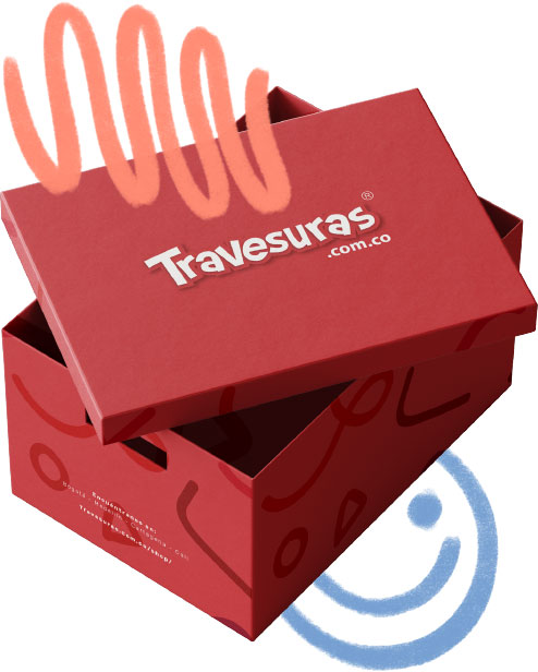
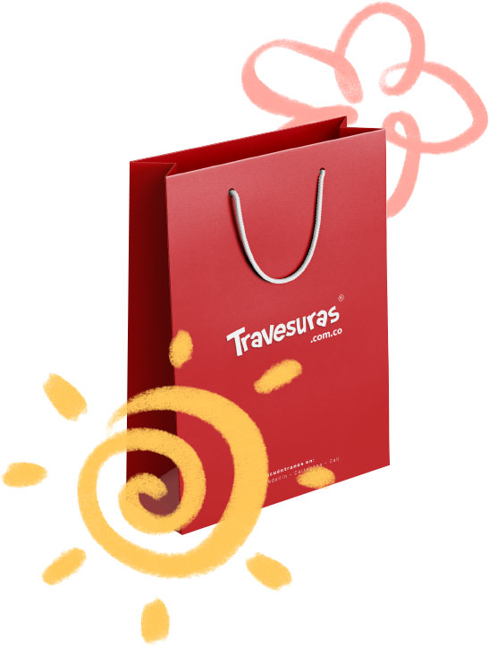
Travesuras has become a benchmark for style and fun. The eye-catching and contemporary packaging design helps strengthen the brand's presence and capture the attention of children and parents alike.


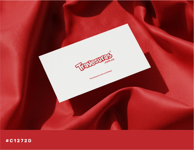
Travesuras demonstrates that it can be fun and professional at the same time. Its well-structured design and color selection allow the brand to have personality on business documents such as letterhead, business cards, vouchers, and envelopes, maintaining a consistent and professional image in every application.
Tell us a little about your project and we will contact you very soon so that together we can make it a reality.
